app · August 2026
OYAKO ABC
A five-minute English game a Japanese parent and a small child play together on one phone. It is designed to feel calm and supportive, with no ads, scores, or streaks.
outcome
No ads · No streaks
A phone app for Japanese families with children aged three to six who are learning the English alphabet. A letter fills the screen, the child taps the picture that starts with it, and the activity ends after about five minutes. Its positioning line is 親子で楽しむ5分英語あそび, five minutes of English play, enjoyed together.
Try the app → · Read the content site →
At a glance
- Two products, one brand. A React PWA for the game, and a separate Astro content site carrying 12 articles across three pillars, written for the parents who arrive before they download anything.
- The parent is part of the experience. The design supports the adult who is guiding the activity, not only the child tapping the screen.
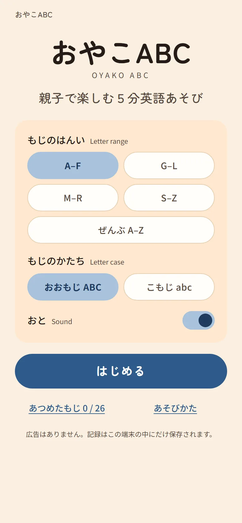
- No score, no streaks, no ads, no accounts. I had all four available and
left all four out. Progress sits in
localStorageon the device. - Six approved brand decisions reversed in a design pass that replaced a generic pastel kids-app look with something modelled on a Japanese picture book.
- Zero
shadowproperties anywhere in the app’s CSS. Elevation is paper tint steps and edges, the way print does it. - 96 unit tests across 20 files, plus 10 Playwright end-to-end tests, all green on the shipped build.
- 105 recorded audio clips (~4 minutes of finished audio) in place of the browser’s speech synthesis, with Web Speech kept as a fallback.
My role
I designed and built both repositories independently: the game, the content site, the design system, the voice script, and the test suites.
The problem worth solving
It would be easy to treat this only as an alphabet game for children. My working hypothesis was that the parent is just as important: they choose the app, guide the activity, and decide whether to return to it.
I designed for a parent who wants to support their child’s English but may not feel confident leading the lesson. The aim is reassurance rather than pressure. Bright rewards and constant animation can make an activity feel more like screen time, while a calm pace can make five shared minutes feel worthwhile.
This is still a hypothesis, not a research finding. I used it to make consistent design decisions, and the next step is to test those decisions with real families. Many of the choices worth describing are things I deliberately left out.
The design pass that reversed six decisions
The first build used familiar children’s-app patterns: rounded cards, saturated primary colours, colour coding for each letter, confetti after a correct answer, and drop shadows. It worked, but it felt generic and busier than the calm experience I wanted.
So I rewrote the design direction around one idea: the app should feel like a 絵本, a Japanese picture book. I used flat printed shapes, paper-like colours, and a small number of inks as the visual reference.
I reversed six decisions already marked Confirmed in the brand guide:
| Change | Why |
|---|---|
| An English-first font stack becomes Zen Maru Gothic + Noto Sans JP | The old stack led with a Latin face and dropped to Japanese as a fallback, which is why the product read as translated. Japanese leads now, and Latin is fitted to it. |
| Andika added for taught English content only | A literacy face with disambiguated letterforms. Restricting it to taught content lets the child tell “the English we are learning” apart from “the app talking.” |
| Per-letter colour coding removed | It failed WCAG contrast and carried no pedagogical value. It was also the loudest generic-kids-app signal in the system. |
| Confetti removed | A single page mark replaces it, the way a child stamps a card. |
shadow removed as an elevation device | Elevation became paper tint steps and edges. No shadow property survives anywhere in the app CSS. |
| An indigo (藍) ink and a sumi scale added | Every approved colour but one failed WCAG against the background. The palette held no dark values at all, which is the mechanical reason the design read as bland. |
I wrote the rules to be checkable rather than arguable: at most three inks visible per screen, every value from a token file, exactly one primary action per screen, 72px minimum tap targets in the child’s half, Japanese set first.
The two-person screen
Two people look at one phone. The original design expressed that nowhere. Every screen splits along it now.
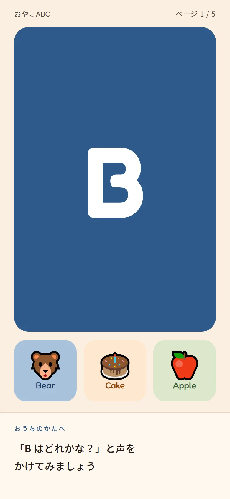
The top two-thirds is the child’s field: one huge letter, three picture cards, tap targets sized for a four-year-old. Below a hairline rule sits the parent band, addressed to おうちのかたへ (“to the grown-up at home”), and it does the one thing the child’s half never does. It tells the parent what to say. 「Bはどれかな?」 と声をかけてみましょう, try asking, “which one is B?”
Without that band, the adult mostly watches the child use an app. With it, they have a clear role in the activity.
Refusing the retention playbook
Streaks, daily counters, score screens and red notification badges are the standard toolkit for an app like this. They are well understood, they work, and I left all of them out.
Streaks went first. A book you are partway through invites you back, while a broken streak accuses you, and manufacturing that guilt is the thing this product exists to undo.
So I count progress in pages and never in days. A session is a spread in a book the two of them are reading together, the header counts ページ 1 / 5, and the screen transitions are page turns.
I score nobody at the end of a session.
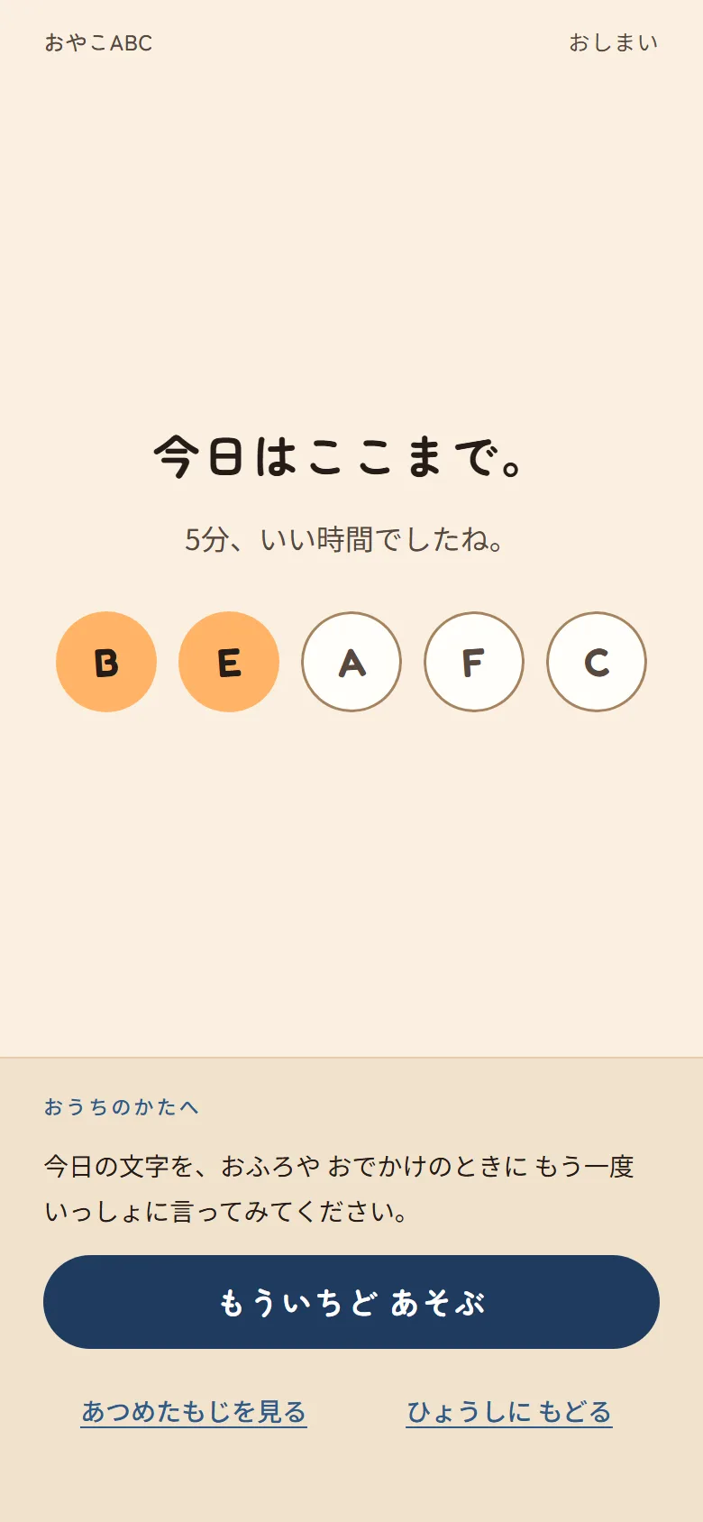
今日はここまで。5分、いい時間でしたね。 That’s it for today. Five minutes, that was good time. The screen names what happened and stamps the letters the child read. There is no percentage, no star rating, no “you got 3 of 5.” The letters he missed are the ones left unfilled, and the parent band suggests saying today’s letters again at bath time.
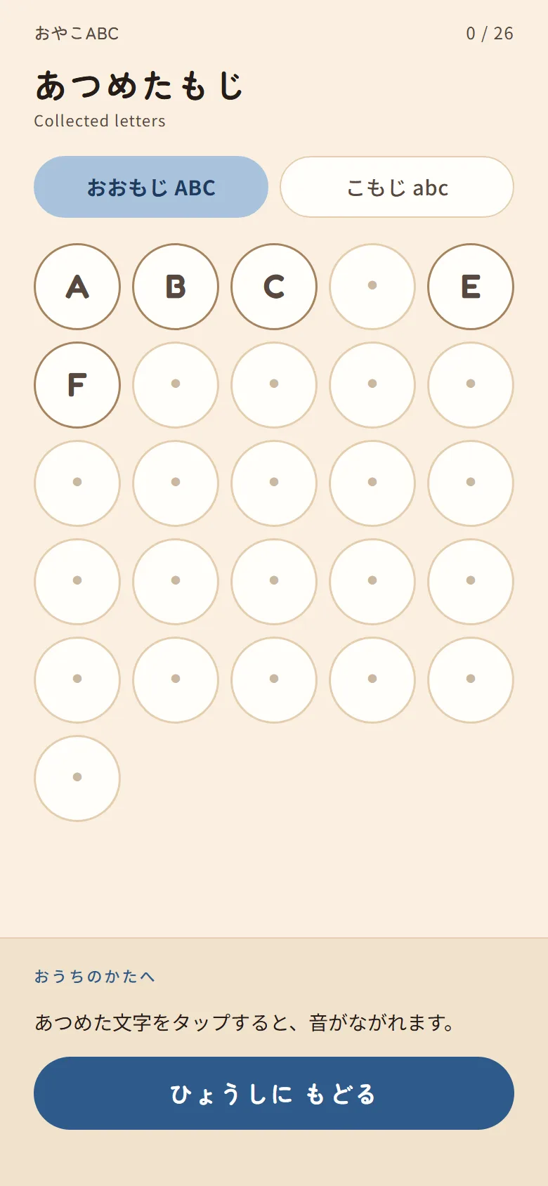
Letters accumulate on a collection screen instead, and the app marks a letter mastered only after three first-try correct answers, so the badge means something beyond one lucky tap.
What that cost, and what it bought
Skipping the playbook costs something. With no streaks and no notifications there is no retention hook, so nothing drags anyone back tomorrow. I am betting that a parent who felt competent during five calm minutes comes back on her own, which is slower and less certain than a red badge.
I am comfortable with that trade. A retention feature based on guilt would work against the supportive experience the product is meant to create.
The same reasoning pulled the ad slots out of the app. I had wired AdSense into an earlier build and it worked, but an ad in the middle of a parent-child activity contradicts everything above. The footer now says so: 広告はありません。記録はこの端末の中にだけ保存されます。 No ads. Records are kept only on this device. No accounts, no backend, and no analytics beyond a cookieless count.
I moved monetisation to the content site, where an ad beside an article costs the reader nothing.
The content site
The second half of the product is a Japanese-first content site at oyako.polynomialworld.com, built in Astro and kept in its own repository. Content work treats the PWA as a black box, so it can never break the game.
Twelve articles sit four apiece across three pillars: entry, for parents who think it is already too late or that their own English is too poor; activity, phrases for bath time, bedtime, the morning routine and rainy days; and parent-learner, covering pronunciation, mixing languages, and restarting after a lapse. The recurring theme is permission: starting late is fine, mixing languages is fine, and making mistakes is fine. It carries the same supportive idea into the written content.
The audio problem
The browser’s built-in speech synthesis was the fast answer and a poor one. Voice quality varies across devices, and a Japanese-locale phone will sometimes read English words with a Japanese phoneme set, which is worse than useless when the point is modelling pronunciation a parent can copy.
So I made the spoken content an asset instead of a runtime call. I wrote a 105-clip recording script covering 26 letter names, 78 phrases and one UI line, specifying that letters are read as names and not phonics sounds, that pace runs 20–30% slower than conversational because the listeners are non-native three-to-six year olds, and that word-final consonants (Hat, Dog, Egg) are the ones they will struggle to hear. The clips are generated from that script and ship with the app. Web Speech stays as a fallback when a clip is missing, and a new clip cancels any speech still in flight.
Stack
The game is React 18 + TypeScript on Vite, with vite-plugin-pwa for the service
worker and manifest, React Router for the five screens, and three contexts
(settings, game, progress). Progress lives in versioned localStorage under a
single key. I test with Vitest and Testing Library at the unit level and
Playwright end-to-end: 96 tests across 20 files, plus 10 E2E specs covering the
full game loop, navigation, and progress recording.
The content site is Astro with content collections, a Zod-validated frontmatter schema, Tailwind, and a generated sitemap, deployed to shared hosting over FTP.
What I would do differently
I should have written the design direction before the first build. Writing the thesis second cost me six reversals of decisions that were already implemented and already approved, and a page of writing up front would have avoided all of it.
The larger gap is user research. No Japanese parent has tested the app yet, so the audience assumptions above are informed design hypotheses rather than proven findings. The next step is to put the app in front of real families, listen to where they struggle, and revise the confident decisions that do not hold up.